
Blog
The Psychology Behind Effective Storefront Signage

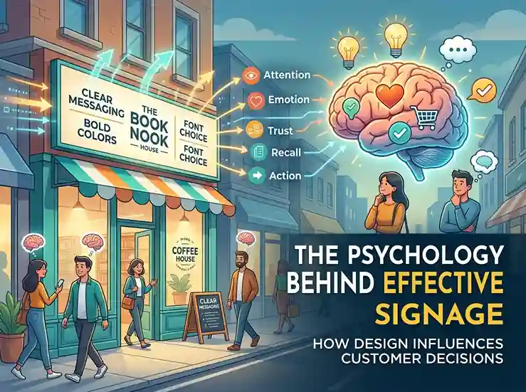
Walk down any commercial street and you’ll pass dozens of storefronts in the time it takes to finish a single thought. Most of them won’t register at all. A handful will catch your eye, and one or two might actually pull you through the door. What separates the signs that vanish into the background from the ones that convert a passerby into a paying customer isn’t luck — it’s psychology.
The psychology of effective storefront signage is informed by decades of research into color perception, cognitive load, typography and human attention. Business owners who understand these principles aren’t just decorating a facade; they’re engineering a split-second decision in the mind of every person who walks by. This guide breaks down exactly how that decision gets made, and what you can do to make sure it works in your favor.
First Impressions: The Split-Second Verdict
Human beings are remarkably fast judges of character, and that instinct doesn’t stop at people — it extends to storefronts. Research on consumer perception shows that a person’s first impression of a business forms within seconds of seeing its signage, with color and font among the very first elements the brain processes. That impression happens well before a customer reads a single word of your tagline or notices your window display.
This is important because your business is not being “chosen” to be trusted by the brain consciously – it is making an automatic, emotional decision based on visual cues. A sign that looks cluttered, outdated, or poorly maintained signals (fairly or not) that the business behind it is disorganized or in decline. Conversely, clean, well-proportioned custom signs with confident typography and appropriate color signals competence and reliability before a customer has any other information to go on.
The stakes here are higher than most retailers assume. Industry research indicates that a majority of shoppers won’t even enter a business that lacks proper, legible signage, and a comparable share have walked into a completely unfamiliar store purely because the signage caught their attention. In other words, your sign isn’t just a label — it’s your first, and sometimes only, sales pitch to someone who has never heard of you.
Why the “Blink Test” Matters
Marketers sometimes call this the blink test: if someone can’t understand what your business is or does within a two- or three-second glance, you’ve likely lost them. Effective storefront signage passes the blink test by prioritizing clarity over cleverness. A sign that requires interpretation — clever wordplay, an obscure logo, tiny text — asks more cognitive effort than most passersby are willing to give.
Color Psychology: The Silent Salesperson
If there’s one element of storefront signage psychology that’s been studied more than any other, it’s color. Color doesn’t just make a sign attractive; it triggers measurable emotional and behavioral responses. Studies suggest that color accounts for the vast majority of a consumer’s initial impression of a brand or product, and that a significant share of shoppers will actually decline to buy something if they dislike its color scheme, while an even larger share are more inclined to buy when the color resonates with them.
Different colors carry different associations, many of which are surprisingly consistent across large groups of people:
- Blue is strongly linked with trust, calm, and professionalism — one reason financial institutions gravitate toward it, and research has found customers are notably more likely to return to a store that leans on blue in its color scheme compared to one built around orange.
- Red creates urgency and excitement, which is why it’s a favorite for sales signage and fast-casual dining brands looking to encourage quick decisions.
- Yellow is often associated with optimism, happiness and approachability and makes an effective colour for family or casual retail concepts.
- Black is always associated with quality, luxury and sophistication and this is why it is popular among premium and boutique brands.
- Green is a color that evokes freshness, health, and sustainability — an easy pick for grocers, wellness brands, and eco-conscious companies.
Color is also central to brand recognition. A large share of consumers associate a brand primarily with its dominant color rather than its name or logo shape, which means consistency between your storefront sign and your broader brand palette isn’t a cosmetic nicety — it’s a recognition tool that compounds in value every time a customer sees it repeated.
Warm Versus Cool: Setting the Emotional Temperature
Beyond individual colors, the larger warm-versus-cool spectrum can influence the feel of a storefront. Warm colors such as reds, oranges, and yellows tend to create energy and urgency, prompting people to make faster, more impulsive choices. Cool colors like blues, greens, and purples cultivate a sense of calm and trust, which works well for businesses that want customers to slow down, browse, and feel comfortable spending time indoors. The shopping experience you want to create should guide your choice between these color schemes, not just what’s trendy.
Typography and Font Choice: Speaking Without Words
Color commands attention, but typography does the more subtle work of establishing credibility. The psychological impact of font choice goes far beyond aesthetics — a good font choice can inspire confidence in a brand, while a bad font choice can sow confusion and quietly erode trust before a customer has even interacted with the business.
Different font styles say different things:
- Serif fonts (those with the little decorative strokes at the ends of the letters) tend to communicate traditional, reliable, and established. Think law firms, financial services, and heritage brands.
- Modern, clean and approachable sans-serif fonts are why they are used by so many tech companies, cafes and modern retailers.
- Script or handwritten fonts convey craftsmanship, intimacy and artisanal quality. They’re great for bakeries, boutiques, and small-batch producers but risky for signage that needs to be read quickly from afar.
- Bold, geometric fonts project confidence and energy and are frequently seen in gyms, sports retailers and youth-oriented brands.
The mistake many business owners make is chasing personality at the expense of legibility. A gorgeous script font that customers can’t read from across the street isn’t communicating craftsmanship — it’s communicating nothing at all. The psychology behind effective storefront signage always circles back to a simple hierarchy: legibility first, personality second.
Simplicity and Cognitive Load: Why Less Is More
Here’s a statistic that surprises most business owners: research into in-store and storefront signage consistently finds that only a small fraction of signs — often estimated between 15 and 20 percent — are actually noticed by shoppers at all. The reason isn’t that people aren’t paying attention; it’s that shoppers operate in a task-based mindset, and the retail environment already presents significant cognitive overload. On a typical shopping trip, people read remarkably few words — often fewer than 20 — because their brains are conserving mental energy for decisions that actually matter to them.
This has a direct implication for storefront design: complexity is the enemy of engagement. Signs packed with multiple messages, several fonts, and competing colors don’t just look busy — behavioral testing shows they actively drive avoidance. When the brain senses that decoding a sign will take real effort, it simply looks away. This is a survival mechanism, not a character flaw in your customers, and fighting it with more text or more decoration only makes things worse.
The fix is a discipline that most successful retail brands share: pick one primary message, one focal color, and one dominant visual element, then let everything else support that hierarchy rather than compete with it. If your storefront needs to say more than one thing, use a secondary sign, a window display, or in-store signage to carry the additional information — don’t cram it all into the primary storefront sign.
Placement and Visibility: The Psychology of Sightlines
Even the most beautifully designed sign fails if it’s placed where no one can see it. Placement psychology is built around the idea of decision points — the specific physical locations where a person is actively deciding which direction to walk, whether to cross a street, or whether a particular storefront is worth a second look. Signs positioned at these decision points, within a clear sightline and at eye level, capture attention far more reliably than signs placed purely for architectural symmetry.
Visibility failures are more common than most retailers realize. Studies on retail signage have found that a large share of shoppers struggle to locate businesses simply because signage wasn’t visible from the street, and that dim lighting compounds the problem by making even well-designed text hard to read. This is particularly relevant in dense commercial districts or “high-information” streets, where researchers using virtual reality and attention-tracking studies have found that an oversaturated visual environment — too many competing signs crammed into a small stretch of street — actually reduces the effectiveness of every individual sign, including yours. In these environments, restraint and strategic placement matter even more than usual, because your sign is competing not just for attention but for cognitive bandwidth already strained by everything else on the block.
Eye-Level Matters More Than You Think
Human eyes are naturally drawn to a horizontal band roughly at head height when walking. Signage that is well above or below this space requires a deliberate, purposeful upward or downward gaze — an extra step most people passing by won’t take. Ideally, your primary signage resides within this natural line of sight and secondary or decorative elements fill the space above or below.
Lighting and Illumination: Guiding Eyes After Dark
Lighting does more than make a sign visible at night — it fundamentally changes how the sign is perceived. Contrast draws the eye to illuminated and digital signage and the numbers help it in a dramatic way. Digital displays have been found to get as much as 400 percent more views than static signage and some businesses that adopt them have reported sales increases of up to 47 percent.
Lighting does more than help us see. It helps us feel. Warm, soft lights create a welcoming, cozy feeling. It’s perfect for cafes, restaurants and boutique retail stores. Crisp white or cool-toned lighting conveys a sense of precision and modernity. It’s often used in tech retail stores, medical offices and minimalist design brands. Neon and LED accent lighting — increasingly popular for both indoor and outdoor storefront signage — adds a pop of color that draws the eye even in daylight, and its glow-based visual effect has become a signature look for brands wanting to feel current and energetic.
The practical takeaway is that lighting should be treated as a design decision, not an afterthought bolted on for nighttime visibility. A sign designed with illumination in mind from the start — considering how light interacts with color, material, and font weight — will perform far better than one where lighting is added later as a functional patch.
Materials, Shape and Texture: Signaling Quality
The tactile and structural qualities of a sign communicate just as much as its color or font. A sign of raw plywood with hand-painted lettering tells a very different story than a sign of brushed metal with precision-cut acrylic lettering, even if it displays the exact same business name in the exact same font. Materials serve as a proxy for quality: customers subconsciously infer the caliber of what’s inside a store from the materials used outside it.
Shape weighs about the same. Rounded, organic shapes tend to feel friendly and approachable, while sharp, angular shapes communicate precision, strength, or modernity. Custom-shaped signs — a silhouette, an icon, a shape that mirrors your logo — create a stronger, more distinctive visual imprint than a standard rectangular sign, because unusual shapes require slightly more processing to interpret, which paradoxically makes them more memorable rather than less, so long as the core message remains legible at a glance.
Texture, too, plays a subtler role. Matte finishes tend to read as understated and premium, while high-gloss finishes can feel energetic or contemporary depending on the color paired with them. These options are not mutually exclusive; the best store signage is one cohesive system of color, font, material, shape, and lighting, not a checklist of independent decisions.
Real-World Psychology-Based Signage Examples
Think about how banks and other financial institutions around the world intentionally use blue — not randomly, but as a direct implementation of the trust associations that color research routinely documents. Or consider how fast-food brands overwhelmingly use red and yellow combinations, a pairing selected precisely because red stimulates appetite and urgency while yellow creates friendliness and speed — together nudging customers toward quick, low-friction decisions rather than lingering deliberation.
In contrast, boutique and artisanal businesses tend to use black, deep green or muted earth tones combined with serif or script typography, deliberately emphasizing craftsmanship and exclusivity over speed. Even the automotive industry has demonstrated the impact of color psychology in physical retail settings: one prominent example revealed that sales discussions held in a blue-toned area of a car dealership were significantly more profitable than similar discussions in rooms with different color schemes – a compelling illustration that these effects are not limited to the sign above the door but also permeate the environment that the sign helps to establish.
What ties these examples together is that none of them came about by accident. Each is a deliberate translation of psychological research into a design choice that influences actual customer behavior, and thus, actual revenue.
Common mistakes that sabotage the psychology of signage
Even those who understand these principles in theory often undermine themselves in execution. Some of the most common mistakes are:
- Message overloading: Trying to communicate the business name, tagline, hours, and a promotional offer all on one sign creates the exact cognitive overload that drives shoppers to look away entirely.
- Ignoring maintenance. A faded, cracked, or flickering sign actively communicates decline, undoing whatever positive psychology the original design intended. Signage should be refreshed the moment it starts to look worn, since a tired sign quietly signals a tired business.
- Mismatched branding. A storefront sign that differs in color or font from the business’s other marketing materials will miss out on the recognition benefits of consistent color and typography.
- Poor contrast. Text that blends too closely with its background — light gray on white, or dark blue on black — sacrifices legibility for the sake of subtlety, which almost always backfires.
- Neglecting the viewing distance and angle. A sign designed to look good in a design mockup can fail completely when viewed from a moving car or across a wide street; testing signage from realistic viewing distances is essential before finalizing a design.
- Copying trends without a strategy. Signage that copies the latest popular font or color scheme, instead of one that fits the specific emotional response a business wants to trigger, often looks current today and generic tomorrow.
Avoiding these pitfalls is often less about creative talent and more about discipline — resisting the urge to add “just one more thing” to a sign that already does its job well.
Bringing It All Together: Designing With Intent
The businesses that get storefront signage right treat it as a strategic discipline, not a final decorative step tacked on after construction is finished. Every decision — the color palette, the font family, the placement height, the lighting temperature, the material finish — either reinforces or undermines the split-second impression a passerby forms in the blink test described earlier. None of these elements should be chosen independently of the others, and none should be chosen independently of the actual customer experience the business is trying to create inside its doors.
This is also why working with a professional signage designer, rather than relying purely on a printer or fabricator, tends to pay for itself. A designer who understands the psychology behind effective storefront signage will ask questions most business owners haven’t considered: What emotional response do you want someone to feel in the two seconds before they decide whether to walk in? What’s the dominant color in your interior, and does your sign prepare customers for it? Is your font legible from the average vehicle speed on your street? These aren’t decorative questions — they’re the difference between a sign that quietly does its job every day and one that blends into the visual noise of the block.