
Blog
10 Types of Business Signs Every Store Owner Should Know About


Next time you’re out running errands, pay attention to which stores actually catch your eye. Chances are, it’s not the biggest store or the one with the best products on the shelf — it’s the one whose sign told you exactly what to expect before you ever walked through the door. Signage does that. It’s easy to overlook because it just sits there, quietly doing its job, but a good sign is basically a salesperson who never clocks out.
Most store owners give signage a lot of thought exactly once: right before opening day. Then it gets forgotten. That’s a shame, because the sign situation outside (and inside) your store keeps working on your behalf — or against you — every single day after that. A sharp well-planned set of signs brings people in, makes their visit easier, and reminds them who you are long after they’ve left. A tired, mismatched, or missing sign does the opposite, and you’ll probably never know exactly how many customers it cost you.
So here’s a rundown of the sign types worth knowing about if you run a store, why each one earns its keep, and a few things to watch out for with each.
Signage Does More Work Than You’d Think
It’s tempting to file signage under “nice to have,” somewhere below inventory and staffing on the priority list. But for a lot of small businesses, the sign out front is the first — and sometimes the only — marketing a potential customer sees before deciding whether to come in. No ad campaign, no social post, just a person walking or driving by and making a split-second call.
Custom signs builds trust before a customer ever says a word to your staff. It tells them what kind of place this is, whether it looks legit, and where to go once they’re inside. Let’s get into the specific types.
1. Storefront Signs

This is the one everyone thinks of first, and for good reason. It’s mounted above your entrance or across the building’s façade, and it’s usually the deciding factor in whether someone even registers that your store exists as they walk or drive by.
Your Acrylic signs is doing brand-building whether you’ve planned it that way or not. Your logo, your name, maybe a short tagline — all of it needs to read clearly at a glance, ideally from across the street and definitely from a car moving at 30 mph. Font choice matters more than people expect here, and so does contrast. A sign that looks great up close but disappears against the building at dusk isn’t pulling its weight.
A few things worth getting right: pick colors that actually stand out against your building material rather than blending in, size your text for sidewalk or street viewing distance (not desk viewing distance), and if you’re open past sunset, spend the money on lighting. An unlit sign after dark is basically an invisible sign.
2. Window Signs and Decals
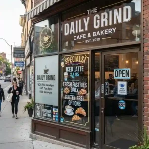
Vinyl decals, static clings, painted lettering, taped-up posters — window signage covers a lot of ground, and it’s popular for one simple reason: it’s cheap and you can change it whenever you want.
Where a storefront sign is basically permanent, your window signage can flex with what’s actually happening in the business right now. Running a weekend sale? Slap it on the glass. Got new hours for the holidays? Same. It’s also where a lot of stores post the practical stuff — accepted payment methods, “we accept returns,” that kind of thing.
The catch is that it’s easy to overdo. Windows covered edge to edge in flyers and posters stop looking like promotion and start looking like clutter, and they block the view into your store, which actually hurts you more than it helps. Swap out promotional signs before they go stale, and even for something temporary, try to keep your fonts and colors on-brand — it’s a small thing, but it adds up.
3. Monument Signs

These are the low, freestanding signs you see planted near the road at shopping centers, office parks, and standalone stores with some space out front. Built from brick, stone, or metal, they’re meant to look permanent and solid, and they usually do.
If your building sits back from the street, a monument sign is often what actually gets you noticed from a passing car, well before anyone’s close enough to read your storefront sign. It’s especially important in shared plazas, where several businesses need to be identified in one spot without stepping on each other.
Scale it to the surroundings — a monument sign that’s too small gets lost, and one that’s oversized just looks odd next to a modest building. Light it if you’re open at night. And if you’re sharing the sign with other tenants, check your lease before assuming you get top billing; placement and size are usually spelled out in the agreement, not up for negotiation later.
4. Pylon Signs
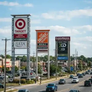
Think of the tall pole signs towering over gas stations and fast food joints along the highway — that’s a pylon sign. They’re built to be seen from way down the road, which is exactly the point when you’re competing for a driver’s attention before they’ve even reached your exit.
If you’re on a busy stretch surrounded by competitors, this is often the sign that decides whether a driver takes your exit at all. By the time they’re at your storefront, the decision’s usually already made.
Zoning laws love to restrict these — height limits, size caps, sometimes outright bans — so check with your city before you get attached to a design. Keep the layout simple and bold; nobody’s reading fine print at 55 mph. If the budget stretches that far, a digital component lets you change pricing or promotions without repainting anything.
5. ADA and Regulatory Signs
Not every sign in your store is there to sell something. In the U.S., the Americans with Disabilities Act requires specific signage in most commercial spaces — restroom markers, exit signs, accessible entrance indicators, occupancy limits, and similar safety information. These aren’t optional extras.
Get this wrong and it’s not just a fine waiting to happen (though it is that). It’s about whether someone using a wheelchair or someone who’s blind can actually navigate your store without a staff member walking them through it. Braille lettering, tactile text, correct mounting height — the details matter more than they might seem to from the outside.
This is one area where it’s worth paying a signage company that actually knows the current codes rather than guessing. Requirements shift from time to time, so it’s worth a periodic check to make sure your store hasn’t quietly fallen out of compliance.
6. Wayfinding Signs
Anyone who’s wandered a big-box store looking for one specific item knows how quickly that turns into frustration. Wayfinding signs — arrows, department labels, “restrooms this way,” floor directories — exist to prevent exactly that feeling.
A customer who can’t find what they want, and doesn’t want to bother asking, often just leaves. That’s a sale gone for a problem that a $30 sign could’ve solved. Beyond the sales angle, good wayfinding also frees up your staff from playing human GPS all day.
Keep the icons and wording consistent throughout the store — don’t call it “Restrooms” on one sign and “WC” on another. Put signs where people are actually making decisions, like aisle intersections, not buried somewhere no one looks. And lean on symbols people already recognize rather than inventing your own visual language.
7. Point-of-Purchase Signs
These are the small signs sitting right at the register or clipped to a shelf edge — shelf talkers, countertop cards, little tent signs promoting a bundle deal. Small, but they’re placed at the exact moment a customer’s wallet is already open.
That’s what makes point-of-purchase signage punch above its weight. The customer has already decided to buy something; a well-timed sign right there can bump up what they buy, or add one more item to the basket. It’s one of the cheapest ways to lift your average transaction size.
Highlight things with real urgency behind them — bestsellers, limited-time deals — rather than generic filler. Keep the design punchy without going overboard, and swap them out regularly. Customers stop noticing a sign that’s been sitting in the same spot for six months; that’s what people mean by “sign blindness.”
8. Banners and Temporary Signs
Vinyl or fabric banners are the workhorse of short-term promotion — grand openings, holiday sales, a flash event you want people to know about this weekend and not a week from now. Cheap to make, quick to put up, quick to take down.
The value here is speed. If a competitor undercuts you, or you’ve got surplus inventory to move, a banner lets you respond in a day instead of waiting weeks for something more permanent. A well-timed “50% Off This Weekend” banner can genuinely move the needle on foot traffic for exactly the days it matters.
Keep the message short and the font big enough to read from across a parking lot — this isn’t the place for three paragraphs of terms and conditions. And take it down once the promotion’s over. Nothing undercuts a business’s credibility quite like a “Grand Opening” banner still hanging there a year later.
9. Vehicle Signs
If you’ve got delivery trucks, service vans, or even a single company car on the road, that vehicle is free advertising space you’re probably underusing. Full wraps, magnetic door panels, window decals — any of these turn a normal commute or delivery run into brand exposure.
This matters most for service businesses that go to the customer rather than the other way around — plumbers, electricians, landscapers, HVAC techs. Every job site, every neighborhood you drive through, is a chance for someone to jot down your number for later.
Make sure there’s an obvious way to actually contact you — phone number, website, something simple and legible at a glance. Reflective materials help with nighttime visibility (and, frankly, with safety). And keep it visually consistent with everything else you’ve branded, so a truck and a storefront feel like the same company.
10. Digital and LED Signs
Digital signs used to be a big-budget item reserved for major retailers, but the cost has come down enough that plenty of small businesses use them now too — anything from a simple scrolling LED message board to a full display running video and real-time updates.
The appeal is obvious once you’ve used one: no more paying someone to swap out letters or reprint a banner every time your specials change. You can update pricing instantly, rotate through multiple promotions, even pull in live info like current wait times. And motion genuinely does grab more attention than a static sign sitting still.
The trap is going overboard — flashing through slides too fast for anyone to actually read, or turning it into pure advertising noise. Plan your content ahead of time rather than scrambling daily, and mix in genuinely useful info (hours, directions, today’s specials) alongside the sales pitch so it doesn’t feel like nonstop marketing.
So Which Signs Actually Need Your Budget?
Ten types of signs is a lot to think about at once, so it helps to narrow it down with a few practical questions rather than trying to do everything at once.
Start with where you’re actually located. A shop tucked into a strip mall has a totally different visibility problem than one on a downtown block with foot traffic passing every few seconds. If people can’t easily see your building from the road, a pylon or monument sign probably matters more than anything else on this list. If you’re already right on the sidewalk, your storefront and window signage will carry most of the weight.
Then there’s budget, obviously. Permanent structures like monument and pylon signs cost real money upfront but last for years. Banners, decals, and window signs are cheap enough that you can experiment — try a message, see if it works, change it next month if it doesn’t.
Don’t skip the legal side either. ADA compliance and zoning rules aren’t the exciting part of signage, but they’re the part that can actually get you fined or forced to redo work, so handle that before you start picking fonts for your promotional banners.
Think about how often things change in your business, too. A store running weekly promotions needs signage that’s easy to swap — window clings, banners, maybe digital displays if the budget allows. A business with a more fixed identity should put its money into a few high-quality, durable pieces instead.
And last, look at the whole picture together. Your storefront sign, your window decals, your POP displays at the register — do they actually look like they belong to the same business? That consistency is what builds trust, more than any single sign on its own.
Mistakes Worth Avoiding
Even store owners who invest in good signage sometimes trip over the same handful of mistakes:
- Cramming too many signs into the storefront and windows until customers can’t tell what’s actually important, or can’t see into the store at all.
- Letting signs fade, flicker, or fall into disrepair — a broken sign says more about your business than you’d like.
- Mixing fonts, colors, and styles across different sign types so nothing feels like it’s from the same company.
- Skipping a professional for design or installation and ending up with something that looks off, or doesn’t actually meet code.
- Forgetting what your signage looks like after dark, especially if you’re open evenings or sitting along a well-lit strip where everyone else’s sign is lit up and yours isn’t.
The Bottom Line
Signage doesn’t get the attention it deserves, considering how much it actually does for a business. It’s working before a customer ever speaks to your staff, and it keeps working long after they’ve walked out the door with a bag in hand.
Storefront, window, monument, pylon, ADA-compliant, wayfinding, point-of-purchase, banners, vehicle, digital — that’s the full toolkit. You don’t need all ten on day one, but it’s worth knowing what each one does so you can spot the gaps in your own setup.
Take a walk around your store sometime this week and look at it the way a first-time customer would. Is anything missing? Does it all look like it belongs to the same business? Small fixes here tend to pay for themselves faster than almost any other marketing spend you’ll make.