
Blog
How Colors in Signage Influence Buying Decisions

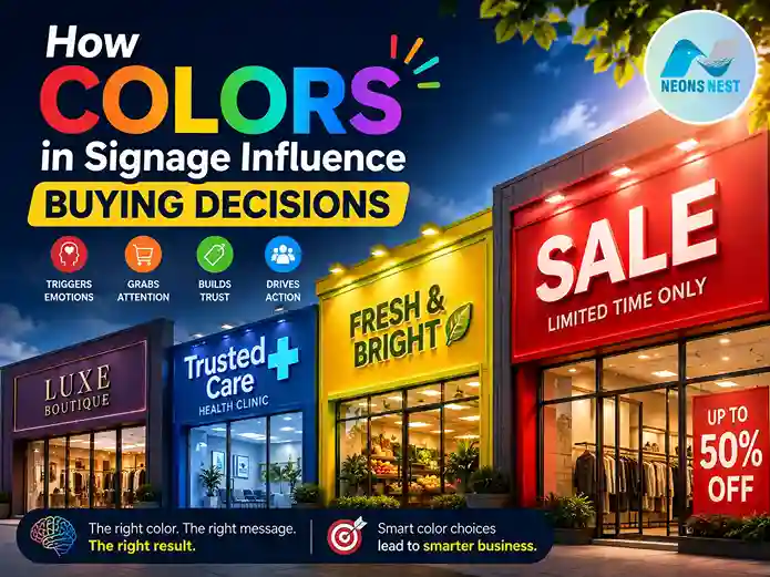
Walk down any commercial street and, before you read a single word, your brain has already made a dozen judgements. That coffee shop with the warm amber sign feels cozy. The clinic with the calming blue lettering feels trustworthy. The clearance rack with the screaming red banner feels urgent, like you might miss out if you don’t act now. None of this is accidental. It’s the result of decades of consumer research into how the human eye and brain process color — and how that processing shapes buying behavior long before logic ever gets a say.
This is the core idea behind how colors in signage influence buying decisions: color isn’t decoration, it’s communication. It’s arguably the fastest, most primal form of marketing a business has, because the brain registers color before it registers shape, and it registers shape before it registers text. Research on consumer perception consistently finds that people form judgments about a product, storefront, or brand within seconds — and that color carries a disproportionate share of that first impression. Some studies put the color-driven portion of that snap judgment as high as 60–90%. Whether the exact number is 62% or 90%, the underlying truth holds: your signage’s color palette is doing marketing work before your copywriting even gets a chance.
For business owners, retail managers, architects, and sign designers, this isn’t a trivial detail to leave to personal taste. It’s a strategic lever. In this guide, we’ll break down the psychology behind specific colors, the science of visibility and contrast, real-world examples from major brands, and practical frameworks you can use to choose signage colors that actually move customers toward a purchase — rather than colors that simply look nice in a mockup.
Why Color Is the First Language of Signage
Before a potential customer reads your business name, before they notice your logo, before they even register what product category you’re in, their visual cortex has already processed color. This happens in a fraction of a second, well ahead of conscious thought. Color is processed by the brain’s limbic system — the same region responsible for emotion and memory — which is why color has such an outsized influence on how people feel about a brand before they’ve had time to think about it.
This matters enormously for signage specifically, because unlike a website or a print ad that someone chooses to engage with, signage is often seen in passing — from a moving car, across a busy street, or in a crowded mall corridor. There’s no time for deliberation. The sign has a window of a few seconds, sometimes less, to communicate what a business is, what it stands for, and whether it’s worth stopping for. Color does that heavy lifting instantly, while typography and copy do the more detailed persuading afterward.
This is also why brand recognition studies repeatedly find that color is one of the single biggest contributors to whether people remember and identify a brand at all. When your signage color is consistent with your broader brand palette — website, packaging, uniforms, vehicle wraps — you’re reinforcing a visual shorthand that customers use to recognize you at a glance, even from a distance or in bad weather, without needing to read a single letter.
The Emotional Shortcut Effect
Psychologists sometimes describe this as an “emotional shortcut.” Rather than analyzing a business rationally, a passerby has an instant gut reaction to the color of the storefront sign, and that gut reaction colors (quite literally) every subsequent judgment they make — including whether the prices seem fair, whether the staff seem friendly, and whether they’re likely to have a good experience inside. Sign color, in other words, is priming. It sets the emotional stage before the actual sales pitch even starts.
The Psychology Behind Specific Sign Colors
Not all colors carry equal weight, and they don’t all communicate the same thing. Here’s a breakdown of the most commonly used signage colors and how they tend to be interpreted, as well as the kinds of businesses and buying situations in which each color works best.
Red: Urgency, Appetite, and Impulse
Red is one of the most physiologically activating colors in the spectrum. It has been shown to increase heart rate and create a subtle sense of urgency, which is exactly why “SALE,” “CLEARANCE,” and “LIMITED TIME” signs are almost universally red. Retailers routinely see measurable conversion lifts when clearance signage uses red rather than more neutral tones, because the color itself reinforces the message of scarcity and time pressure. Fast food chains lean on red for a different but related reason: it’s associated with appetite stimulation, which is a major part of why so many quick-service restaurant logos and signs use red as a dominant or accent color.
The caveat is that red doesn’t work everywhere. For high-consideration purchases — financial services, healthcare, luxury goods — red can feel aggressive or even alarming, undermining the sense of calm deliberation those categories need to sell effectively. In these cases, red works best as a subtle accent to a single call-to-action element, rather than the major signifier.
Yellow and Orange: Attention, Optimism
Yellow is the most visible color to the human eye in daylight conditions, which is why it’s the default choice for caution signs, taxis, and high-visibility storefronts. It grabs attention quicker than nearly any other hue, and has strong associations with optimism, friendliness, and affordability. Orange is in a similar emotional space, but is a touch warmer and more energetic, and is a popular choice for brands that want to feel approachable, fun, and a little less “corporate” than a pure red or blue palette would suggest. The tradeoff with both colors is that, used at full saturation across large surfaces, they can begin to feel cheap or overwhelming rather than energetic. Signage designers often solve this by pairing yellow or orange with a grounding neutral — black, navy, or deep gray — so the warmth reads as vibrant rather than garish.
Blue: Trust, Calm, and Reliability
Blue is consistently rated across consumer research as the color most associated with trustworthiness, professionalism, and calm. This is precisely why it dominates signage in banking, healthcare, insurance, and technology — categories where the buying decision hinges on a customer feeling secure rather than excited. There’s a well-known example from the auto industry: a dealership testing sales environments found that conversations conducted in a blue-toned space closed at meaningfully higher rates than those held in rooms with warmer color schemes, because the calming effect of blue lowered customer defensiveness during a high-stakes negotiation.
For signage specifically, blue works exceptionally well when the buying decision requires deliberation rather than impulse — anything where the customer needs to feel like they’re making a safe, well-considered choice rather than an emotional one.
Green: Health, Growth, and Sustainability
Green has become almost shorthand for “natural,” “organic,” and “environmentally responsible” in modern retail signage, and it performs especially well for wellness brands, grocers, pharmacies, and sustainability-focused businesses. It’s also a restful color on the eye, which makes it a strong choice for signage in spaces where you want customers to linger rather than feel rushed — spas, garden centers, and health food stores, for example.
Black and White: Premium Positioning
Cross-cultural consumer research has consistently found that black packaging and black signage are perceived as more premium and higher-quality than warmer, brighter alternatives, while colors like brown and light orange tend to be rated as signaling lower quality. This is a major reason luxury retailers so often default to black, white, or muted metallic signage rather than bold color: the restraint itself communicates exclusivity. A minimalist black-on-white sign, especially with generous negative space, signals confidence — “we don’t need to shout to get your attention.”
Purple: Luxury and Creativity
Purple has historically been associated with royalty and remains strongly linked to luxury, creativity, and a sense of the unconventional. It’s less commonly used in signage simply because it’s harder to produce in high-visibility, high-contrast formats, but for beauty brands, creative agencies, and boutique retailers, it can be a highly effective way to signal a premium, imaginative brand identity that stands apart from the sea of red-and-blue competitors.
Color, Contrast, and the Science of Visibility
Choosing an emotionally resonant color is only half the battle. If a sign can’t be read quickly and clearly, none of that psychological groundwork matters, because the customer never receives the message at all. This is where contrast becomes just as important as color choice itself.
Accessibility guidelines commonly recommend a minimum contrast ratio of 4.5:1 between text and background for readability, and this standard applies just as much to physical signage as it does to websites. Dark text on a light background, or light text on a dark background, is almost always safer than pairing two colors of similar brightness, no matter how well those colors work thematically. A beautifully on-brand sign in muted gold text on a cream background might look elegant in a design mockup, but if it’s unreadable from thirty feet away or in low afternoon light, it fails at its most basic job.
This is especially critical for exterior and drive-by signage, where viewing conditions vary constantly — bright midday sun, dusk, rain, and artificial lighting at night. Testing signage under multiple lighting conditions before finalizing a design isn’t an optional nicety; it’s a core part of the process for any business serious about converting foot traffic and drive-by attention into actual store visits.
Illuminated and Neon Signage
Backlit, LED neon signage introduces another layer to this conversation, because the color is emitting light rather than simply reflecting it. This makes illuminated signage disproportionately effective after dark and in low-visibility conditions, which is part of why neon and LED signs have remained a fixture of nightlife districts, restaurants, and 24-hour businesses for generations. The glow of a colored neon sign doesn’t just make a business visible at night — it creates an emotional atmosphere around the storefront itself, turning the sign into part of the customer experience rather than just a label.
How Color Shapes the Complete Buying Journey
It’s tempting to think of signage color as something that only matters at the “attract attention” stage, but its influence extends much further into the buying journey than most business owners assume.
First Impressions and Foot Traffic
The earliest touchpoint is simply getting someone to notice a business exists and to form a positive enough impression to consider walking in. This is where high visibility, high contrast colors do their most important work, cutting through visual clutter on a busy street or in a crowded shopping center.
In-Store Navigation and Dwell Time
Once inside, signage color continues to guide behavior. Directional signs, department markers and promotional signage all use color coding to help customers navigate intuitively, reducing friction and frustration. Retailers frequently use color coded signage to segment sale items, new arrivals or premium collections, allowing shoppers to self navigate toward the sections most likely to convert into a purchase without needing staff assistance for every question.
The Final Push: Point-of-Sale Signage
At the point of decision—the shelf edge, the checkout counter, the final call-to-action sign—color often makes its most direct contribution to conversion. High-visibility colors used on price tags, promotional badges and checkout signage, in contrast, offer a final nudge that can make a meaningful difference to whether or not a customer goes ahead with a purchase they were already considering. This is part of the reason that red and yellow remain so dominant in clearance and promotional signage specifically: they’re optimized for that final split-second decision, not for building long-term brand trust.
Real-World Examples Worth Studying
Some of the world’s most recognizable brands have built entire customer experiences around a deliberate signage color strategy, and studying them provides a practical education in how colors in signage impact buying decisions in the real world.
Quick-service restaurant chains overwhelmingly cluster around red and yellow combinations, and this isn’t a coincidence of taste — it reflects decades of testing around appetite stimulation and attention-grabbing visibility in high-traffic, fast-decision environments. A customer driving past at 40 miles an hour needs to register “food, fast, here” almost instantly, and warm, high-contrast colors are simply better suited to that job than cooler, calmer palettes.
Retailers built around discount and clearance positioning, meanwhile, tend to build red deeply into their entire in-store signage system rather than reserving it only for sale events — using it consistently enough that the color itself becomes associated with value, urgency, and exciting bargains, reinforcing the brand’s core promise every time a customer walks in.
At the opposite end of the spectrum, financial institutions, hospitals, and technology companies gravitate toward blue precisely because their buying decisions require the customer to feel secure and unhurried rather than excited. A bank that used aggressive red-and-yellow signage would likely undermine the sense of stability its entire business model depends on, regardless of how attention-grabbing that signage might be.
Common Mistakes Businesses Make With Signage Color
Even with all this research available, businesses regularly make avoidable mistakes when choosing signage colors — mistakes that quietly undercut how effectively their signage influences buying decisions.
The most common error is choosing colors based purely on personal or founder preference rather than target customer psychology. A color palette that the owner personally loves may say nothing useful to the actual demographic walking past the storefront, and demographic fit matters: younger audiences tend to respond more strongly to bold, saturated colors, while older demographics often respond better to more restrained, classic palettes.
A second common mistake is inconsistency across touchpoints — a storefront sign in one palette, a website in another, and packaging in a third. This dilutes the brand recognition benefits that consistent color usage is specifically designed to build, forcing customers to relearn the brand’s visual identity at every interaction rather than reinforcing it.
A third mistake is prioritizing aesthetics over legibility, particularly with trendy color pairings that look striking in a design portfolio but fail the basic contrast test in real-world lighting. No matter how emotionally resonant a color choice is, a sign that can’t be read quickly in transit is a sign that isn’t doing its job.
Finally, many businesses fail to test their signage in situ before committing. A color combination that looks perfect on a monitor can shift entirely under sodium streetlights, fluorescent mall lighting, or bright midday sun — and the only reliable way to catch this is to physically test proofs or mockups in the actual environment where the sign will live.
A Practical Framework for Choosing Signage Colors
For businesses looking to apply all of this strategically rather than instinctively, a simple framework helps:
First, identify the emotional response the buying decision requires. Impulse and urgency-driven purchases favor warm, high-energy colors like red, orange, and yellow. Considered, trust-dependent purchases favor cooler, calmer colors like blue and green. Premium and luxury positioning favors restraint — black, white, and muted or metallic tones. Second, audit your existing brand palette and demographic. Whatever color you choose for signage should align with your broader brand identity and resonate with the age group and lifestyle of your actual customer base, not an idealized or aspirational one.
Third, prioritize contrast and legibility above trend. Run any shortlisted color combination through a basic contrast check, and mock it up under multiple lighting conditions — daylight, dusk, and artificial night lighting — before finalizing.
Fourth, use color strategically across the customer journey rather than only at the storefront. Extend your color logic into in-store navigation signage and point-of-sale displays so that the emotional groundwork laid by your exterior sign carries all the way through to the final purchase decision.
Fifth, test and iterate. Where possible, track how changes in signage color correlate with foot traffic, dwell time, and conversion, the same way a retailer might A/B test a website’s call-to-action button. Signage color is a marketing variable like any other, and it deserves the same data-informed approach.